Browsing all posts tagged design

Simplicity in Design

Jan 16, 2020

One of the best things about picking up woodworking as a hobby has been the learning process. Every project has taught me a number of new things, whether it's a new tool, technique, or construction method. My latest project was a kitchen bench which I designed myself using Sketchup Make 2017. One of the lessons this project taught me was not to over-complicate a design.

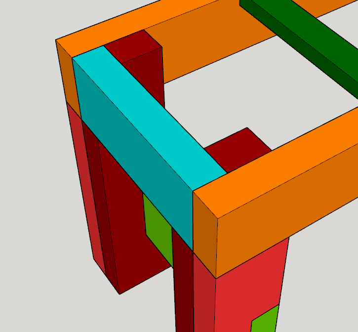
The following images show two designs for the leg assembly for the bench. The first design is what I built; the second is a simplified variant.

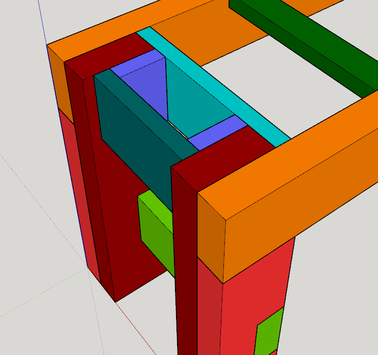
The first design made attaching the bench top more difficult than it should have been at the ends. It also complicated the finishing process, and resulted in the purchase of additional material (4/4 poplar, in this case, rather than the 8/4 I used elsewhere in the frame). I only discovered this after building the first design, of course, but that's all part of the learning process. My intention with design 1 was to improve the look and feel of the ends of the frame, but the irony is that this portion is nearly invisible with the top in place.

As I design future projects, I now know to take issues like these into account.

Migrating to HTML 5

Jan 20, 2015

After sitting on an XHTML Strict template for years and years, I've finally migrated this site's theme to HTML 5. A number of new elements have been put to use, styles have been trimmed a little, and I'm using one less web-font. Hopefully I haven't broken too much; if you spot something, let me know in the comments below. As always, expect sporadic updates as I add polish.

I have just pushed out the responsive version of this site's theme, so you should see it immediately. Though the various tweaks may not be immediately apparent, the experience of this site on a mobile device or tablet (or a smaller screen in general) should be much better than before. Resize your browser window in the horizontal direction to see the style changes in real time!

There are still a few pain points to work through:

  1. I'm still a little unsure how to handle the syntax-highlighted code snippets in the various posts around the site. Snippets that don't use syntax highlighting will word-wrap, but the syntax-highlighted blocks currently just offer a horizontal scroll bar.
  2. Various images in older posts need to have their hard-coded sizes removed from the img tags, so that they'll scale appropriately. This is just a matter of going through and making those changes.

There could be other issues that I have yet to stumble across. From my limited testing, the site looks alright in Firefox, Chrome, and IE-9. I'm sure I'll be tweaking stuff here and there over the next few days. If you spot problems, please let me know by leaving a comment.

I'm currently working on converting this site's layout to a fluid, responsive-design variant, which will make the site much more usable on mobile devices (as of this writing, the mobile experience is pretty bad). In my efforts to improve the design, I noted that the browser on my Android phone didn't respond to my changes at all. The Responsive Design View in Firefox yielded acceptable results, as did the developer tools available in Chrome (which, by the way, are pretty terrible). So why did my phone look so different?

The answer has to do with the concept of the viewport. I found a terrific pair of articles detailing the ideas behind viewports on both the desktop and mobile devices (be sure to read the desktop article first; it sets the stage for the second). It turns out that my page's header was missing a key meta element, whose very existence we can thank Apple (of all people) for. The tag looks like this:

<meta name="viewport"
      content="width=device-width, initial-scale=1, maximum-scale=8" />

Using this meta entry allows devices to scale their layout viewport appropriately. Adding this one element fixed my phone, causing the site to render as expected. There are other articles that discuss this element better than I could, so give them a look. And don't forget this one line if you're designing responsively; it'll save you a lot of potential headache!

One minor annoyance I have always had while surfing the web, is the non-standardized order in which you consume a website's content. Two pertinent examples spring to mind. First, are the "post navigation" links that you find on many websites. Out of the box, WordPress uses a link pointing to the left to indicate older posts (example: « Older posts), while a link to the right indicates newer posts (example: Newer posts »). This design decision no doubt stems from the humble beginning of the blog: the journal (as in the pen and paper variant). In English, we read left-to-right, top-to-bottom; and in a pen and paper journal, newer entries are always "to the right of" older ones. I'm sure this is one reason why WordPress themes come as they do. I have always taken the opposite stance, however. Digital entries on a site are not (in my mind) the same as handwritten entries in a journal. So I have always used a link pointing to the right to indicate older posts, while a link pointing the left indicates newer ones. In short, the newest content appears "first".

My opinion changes with my second example, however. The Twitter timeline presents the newest tweets at the top of your home page. This seems like a major design flaw, since I am seemingly shoe-horned into reading tweets in reverse order. My typical modus operandi for reading Tweets is to scroll down to my last known position, and work my way back up to the top of the page. This is really bothersome to have to do. I'd love to have an option to have the newest stuff appear last, so I could consume the content as it was presented to me.

I take a similar stance in Google Reader. I used to browse items in "newest first" mode, but I stopped doing that since I would see stories in reverse order. After switching to reading items in the "oldest first" mode, I've been much happier; it feels much more natural to me. I'm not sure why I feel so differently about two remarkably similar items, but I do.

Which order do you prefer? Is there a "right" way to do it?

Drop Shadows With CSS

Jan 11, 2010

Over the holiday break, I stumbled upon a wonderful article describing several CSS tricks to add eye-candy without images. I've been using rounded corners here at the site since the last theme update, and thanks to this article, I'm now employing drop shadows. The effect is subtle, but adds a lot to the design; in short, I like it.

The style rules for adding drop shadows are very simple, though proprietary; it's a shame this stuff can't be standardized properly. Here's the code to use a drop shadow (the values shown are the ones I'm using on the site):

#myelement {
    -moz-box-shadow: 1px 1px 3px rgba(0, 0, 0, 0.5); /* Firefox */
    -webkit-box-shadow: 1px 1px 3px rgba(0, 0, 0, 0.5); /* Webkit */
    box-shadow: 1px 1px 3px rgba(0, 0, 0, 0.5); /* Standards way */
}

The article even details the appropriate style code for Internet Explorer, but I haven't included it here, mainly because it's ugly. Other effects that the article explains are glow (the opposite of drop shadow, essentially), gradients, rotating images with CSS, transparency, and a few more advanced tricks. It's great that this support is built-in to most standards compliant browsers. So long to those annoying images that try so desperately to do the same thing!

Update: So it turns out that adding this eye candy significantly reduces scrolling performance in Firefox (quite an annoyance). Chrome doesn't have this issue, so it's clearly a Firefox problem. Should I keep the shadows and suffer the performance hit? Or should I chuck them and keep things snappy?

Also, Webkit browsers don't support the inset modifier for shadows, which means you see even less eye candy in Chrome, et al.

Update 2: I've removed the drop shadows for the time being. After all, this stuff is experimental.

Blocking IE 6?

Oct 25, 2009

I am considering blocking all users who use Internet Explorer 6 from viewing this website (support will remain for Born Geek). Viewers using this old browser would instead be given a dialog offering links to other, more competent browsers (including IE 7 and 8). Is there anyone who regularly visits this website that still uses IE 6 and doesn't want me to block them? I see that IE 6 still accounts for 13.5% of traffic to this site, which is surprising to me. Interestingly enough, Firefox only accounts for 37.7% of the visitors here.

If you're an IE 6 user, and you want to continue viewing this site in your antiquated browser, let me know in the comments. If I don't hear from anyone in the next two weeks, I'm gonna drop the ban hammer and start rejecting visitors who use it.

For some time now, Firefox has supported an experimental CSS technique for rounding border corners (-moz-border-radius). The rendering engine in Firefox 2 does a barely acceptable job with this, though the rounded corners don't appear to be uniformly sized, nor are they anti-aliased. Cairo, which drives the rendering engine in Firefox 3, does a much better job at handling the rounded corners, and the results are quite nice.

As such, I'm offering some 'eye-candy' to those users who visit this site with either Minefield or a Firefox 3 beta build. Those users will now note that code blocks (pre elements), as well as comment blocks, have nicely rounded edges. The end result looks great, and I hope you agree.

The Acid3 test for web browsers has been released. Drunken Fist has a number of screenshots that show the failure rate among the various top browsers. There are some really interesting results from the tests:

  • Safari 3: 39% success (latest nightlies are up to 87%)
  • Firefox 3: 59% success
  • Firefox 2: 50% success
  • Opera 9: 46% success
  • IE 7: 12% success
  • IE 6: 11% success

Safari is the surprising top dog in the list, but what I find most interesting is that Firefox 3 (which passes the Acid2 test) only hits 59% in the new test. I would have guessed that being Acid2 compliant would mean being nearly Acid3 compliant. Apparently, that isn't the case. It looks like web browsers still have a long way to go in the standards race.

Accessible Hidden Text

Jul 10, 2007

I just ran across an excellent article entitled Why “left: -9999px;” is Better For Accessibility Than “display: none;”. It discusses the two primary means by which web developers try to hide text (usually to allow for accessible logos or titles), and why using an offset is (often) better than just simply making it invisible. The author also explains why this is better, using some documentation from Microsoft on Internet Explorer accessibility. Looks like I need to fix my websites!

CNN Redesign

Jul 5, 2007

I've been out of town, so I know that this story is a few days old, but I really dig the new look at CNN.com. It's clean, sleek, and takes up much more screen real estate. The HTML doesn't validate, nor does the CSS, but I still think this is a step in the right direction.

SimpleBits Rebranding

Dec 5, 2006

Dan Cederholm has rebranded SimpleBits, and the results are very nice. If I had 1% of this man's creative genius, I would be quite pleased with myself.

Color Blind

Nov 20, 2006

For me, one of the most frustrating aspects of web design is the actual design step. Coding a given design? Easy. Making that design standards compliant? No problem. Actually coming up with the design concept itself? Mind-numbingly difficult. I occasionally check the Color Schemer Galleries for decent schemes, and there are a number of nice ones there, but determining how to use each color is a task I struggle to succeed at.

Does anyone have any strategies they use? Any pointers to decent resources? I already know about the Color Harmonies site and the Visibone Webmaster's Color Lab. Can anyone do this, or must one be an 'artist' to excel?

CMS Search Continues

Nov 11, 2006

Last year at this time, I was thinking about various content management systems for user over at Born Geek (sister site to this blog). I never made a decision, mostly because so many of the available options seemed weak to me. One year later, very little has changed and I'm still looking to migrate the site from the hand-built system I use today to a database driven solution.

Currently, I'm leaning towards using WordPress, the same package I use here at this blog. I like the interface that it offers, its documentation is top notch, and I'm already quite familiar with it. The only real downside I can see with the package is that pages are built on the fly. Every month, Born Geek averages 1.56 GB of data transferred, 542,818 hits, and 17,955 unique users. With this much activity on the site, I'm a little concerned about database accesses and the subsequent processor time needed to generate each page. A caching plug-in is available for WordPress, and I hear decent things about it. But will it be enough?

I'm seriously thinking about giving it a try later this winter (converting the site will take some time). So keep your eyes peeled. In the mean time, if you have suggestions for CMS-like systems that might fit the bill, let me know. I'm certainly open to suggestions.

Cleaning Up Slashdot

Jun 10, 2006

I know it has been live for a few days now, but the new design over at Slashdot is a most welcome change. The site had become quite crufty, looking more like a website from the mid-1990's than a hip, modern site of today. This new CSS redesign has made the site much cleaner, and I have to believe that they are now enjoying significant bandwidth savings since they've gone the CSS route (though their markup still isn't the prettiest in the world). Hopefully this face lift will boost the site's apparently sagging popularity. I for one, am most pleased with what they've done.

Zeldman Transforms

Mar 9, 2006

My daily web surfing routine offered up quite a surprise today: Jeffrey Zeldman has switched to using WordPress. Yes ... you read that right.

Over 11 years of hand-coding are done. Finished. Kaput. Jeffrey is the guy who turned me on to web standards (something I now swear by), thanks to that tome of enlightenment that he so lovingly authored: Designing With Web Standards. I read his advice; hung on his every word. And now I practice what the book preaches.

Dare I now convert Born Geek? For you see, I too still code by hand. It delights me, just as it delighted Mr. Zeldman. Being able to wield the elements of HTML, and then commanding them to do your bidding through CSS, is empowering to say the least. But that empowerment doesn't come cheap.

What great food for thought.

Those Redesign Blues

Mar 9, 2006

It's high time that Born Geek had a facelift, so I'm in the process of brainstorming, sketching, and Photoshopping site layout ideas. Unfortunately, my lack of artistic ability hinders what little creativity I have. Fortunately, there are several incredible sources of inspiration on the web:

My current dilemma: fixed or fluid width? The current incarnation of the site is fluid (in the sense that increasing text size increases the site's width). Accessibility is improved with such designs ... but the actual designing step is that much harder. Getting things to look nice at all scale factors is quite a trick.

Too often I just jump into the code and play around until I have something I like. This time around, however, I plan on doing things a little more formally; namely, creating a design in Photoshop before I even write the first bits of code. Not only will that help me visualize the layout better in a shorter amount of time, but it also gives me a chance to play with Photoshop CS2. My target window for the redesign is sometime within the next 60 days.

The Holy Grail Found

Feb 1, 2006

The holy grail of CSS layouts has apparently been located by one Matthew Levine. Although I personally had never been searching for it, I was aware that people were. A number of potential grail candidates had apparently surfaced over time, but none have been as simple and elegant as the one found most recently.

This finding illustrates one of the main problems with CSS: columns. Placing content into columns is tough to begin with (even if we make use of illegitimate table layouts). Fortunately, CSS3 plans to add native column support. Unfortunately, support for that is still years down the road. And Microsoft is likely to never support it; they only support the "standards" for which they are sole author. Regardless, a tip of the hat to Matthew for sharing this gem with us. The world will never be the same.

In these days of modern web design, it shocks me to see professional websites still using design techniques from the 1990s. One notable example is the use of text like "click here" to create a hyperlink. As the title of this post suggests, your site's users are not complete morons. We all learned about hyperlinks in the 1990s, so the helpful instruction that you are trying to provide your users is simply redundant (we already know where or where not to click).

For example, take this eWeek article on Google's Big Daddy overhaul. There are two places in the article where the aforementioned error occurs. Both instances, interestingly enough, are the only underlined links in the entire article. This fact points out one area where this "error" as I've called it is actually acceptable (although the underlying problem is one that is still frowned upon).

Many websites style their hyperlinks as regular text; that is, the links don't appear underlined. There are two methods that such sites employ to help users identify these plain text links: either the link is rendered using a different color, or the link is rendered with a bold font weight. Both ways, I would argue, are inaccessible. That argument aside, however, the text "click here" can actually become useful for color blind or low vision users. It provides some sort of clue as to where the user should click to proceed.

I offer you then two suggestions for your own website. First, style your links using something that's plainly obvious to see (underlines work great). And second, don't feel the need to use "click here" as the text for a hyperlink. If your links are styled correctly, you shouldn't need such redundancy.

Many websites use an image as the background of a page element (take the header of this website, for example). And all too often, those websites do not provide a corresponding background color to go along with that image. Take, for example, the games section of Slashdot. The purple background for each headline is an image. In order for the headline text to be readable on this background, the text color is set to white. The following rules are used in the corresponding CSS file (the image URL has been chopped for formatting reasons):

.generaltitle h3
{
    margin: 0;
    padding: .3em .8em .2em .8em;
    color: #fff;
}

#slashboxes h4, .article h3, .generaltitle h3
{
    background: url(<path>) repeat-x;
    padding: .3em 0;
}

Note that no background color has been specified for the h3 element. What is the effect of this omission? If images are disabled, we end up with white text on a white background, rendering the page illegible! "But who would turn images off?" you ask. People on dial-up may turn them off (to speed up download times). Some low-vision users may also turn them off, to prevent distracting backgrounds (and presumably improve text contrast). And keep in mind that the image file may be corrupted, or the server that actually serves up the images (if they are located separately from the site content) may go down, causing images to be inaccessible. Regardless, a specified background color would fix this problem. The image would override the color (when images are available and enabled), but the color would get used when images are disabled.

If you ever develop a website, and you use images to specify a certain region, make sure that you also specify a corresponding background color. Web users the world over will thank you for it.